
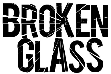
This great broken glass effect can be used for creating effective text effects for your websites or logos. The broken glass effect is relatively simple to create. Throughout this tutorial, I will teach you the skills needed to create this cool effect in Adobe Illustrator.
Preparing the text
The first step is to get a strong headline font – the typeface that you will see in a newspaper or comic book. I went for the font “Bebas” in this example, which can be downloaded for free here. Now type out your text, preferably in two separate text boxes, positioned beneath each other. I find it helps to decrease the tracking (the distance between characters) to create a more compact logo. (This setting can be found under the Character toolbox). I decreased the tracking to -50, shown below. This will help the broken glass effect become more prominent.

To create a bolder and more comical effect, try selecting individual characters and modifying their font size, as I did shown below.

Creating the broken glass look
Before you can start applying path effects to the text, you have to convert it to an object. You can do this by selecting the text and clicking Object > Expand. Once you do this you will no longer be able to change the text or font. Now you can start cutting up the text into pieces. Create a new layer and start drawing triangles with the pen tool where you would like the glass fractures to be, as shown below.

Now, select a triangle shape and click on Object > Path > Divide Objects Below. Do this for every triangle segment. Unfortunately, you can’t do this by selecting them all at the same time, though it won’t take long to do them one by one. When you have finished you will notice all the triangles will have disappeared and you will be left with your original text spliced up. In order to edit or move the individual selections, you will need to ungroup the selection as shown below.

Now, you can begin to start selecting the individual fragments and moving them apart. Try adjusting the size of the fragments and nudging them outwards using the cursor keys. You can also try rotating them slightly to add a more scattered look. If the shards of “glass” appear too close together or overlaps too much, you can try adding a white stroke to the outline to try separate them visually. Secondly, you can try breaking up the logo more using circular lines similar to the steps above, to create a more realistic broken glass look. You should come up with something as shown below.
Tweak around with your design until you are happy with the overall look, and don’t be afraid to experiment. Try incorporate this effect into your logos – it can look really effective if only applied to one or two words in your logo – especially if you would like to portray a “smashing” or “heavy impact” connotation to your brand.
Brilliant tut! It looks so simple, but the result is absolutely beautiful. Thanks for sharing.
Very cool result! So obvious with the divide function that I use all the time but I would have never thought of this. Thanks for sharing!
i like the effect. good job. thanks
Nice and simple )
Thats a cool tutorial justLV. I have just started designing and am learning the Illustrator. I wish I can get the same effect on Photoshop too. I will try experimenting these steps there. I loved the tutorial and after implementing it on a text all I can say is – it looks great. I will share it with my friends.
Thanks
Nice tut.. But you CAN break everything up with just one action.. just select all and then use the pathfinder -> divide to break everything up in small parts.. Good luck ppl
Mr.Alvey thanks very much for this tutorial. I’ve just started with Illustrator and this was my first test project. Directions were easy to follow and really helping to build my confidence with this tool.
Thanks
thanx for the tip.. keep em coming guys
Thanks for showing me how to do this but I’ll see if Bryan (a commenter above) has a point. Will have to try both methods and see which is easier. However, I’m not all that cluey with all this stuff so it’ll be interesting.
great share! i follow your shares =)) it’s enjoyable to trying that tutorials…
lame
When i create he try angles and i go to move one of them, all of them move and i cant select one individual triangle… any help?
I’ve been browsing online far more than 3 hours today, however I never ever discovered any interesting article like yours. It’s pretty worth enough for me. In my view, if all internet site owners and bloggers made superior content as you did, the net might be a lot more beneficial than ever before.
This is awesome…!!
but how to make broken glass background? Do you any tutorials for that?
thx
Nice effect, I have tried to recreate this broken glass effect in Photoshop, and here is my result http://www.psd-dude.com/tutorials/photoshop.aspx?t=create-a-broken-glass-text-in-photoshop
im new to illustrator. this is a very cool tutorial…but how would i do the name thing for an photograph?
Very new to vectors here, and this little guide on broken glass effect for text has really helped me understand a few things. Thanks.