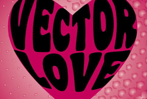

In this tutorial, we will see how we can warp the text around a shape or a object. This technique will show you how to combine the text wrap and heart shape together to achieve the text wrap effect. This tutorial will concentrate on how to use Envelope Distort feature in Illustrator to achieve this effect. You will also learn some new techniques along the way. For this to work effectively, first we have to decide on a suitable shape. Secondly, we will need to decide what word to warp inside the shape. Normally a short phrase works best. And finally, we need a thick and fancy font to pull the trick.
For this tutorial, we will be using a heart shape since Valentine’s Day is around the corner. We will be using a font Coaster for the words. We will write the words, “Vector Love” to declare out love for vectors. But you can choose any shape, fonts, words etc… Experiment with different shapes and words to see which works best. Also, if you are using more complex shape or curved lines just be careful that the words remain legible.
Step 1:
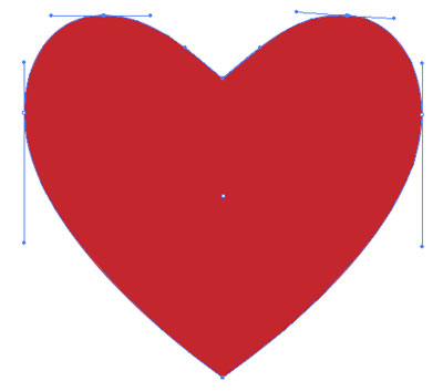
Draw a heart shape with Pen Tool (P). Fill it with red color or any color you wish and set the stroke to None.
Step 2:
Select the heart shape, copy it by clicking Edit > Copy and paste using Edit > Paste in Front. Select one of the heart and in the Layer Palette. Hide and lock it by clicking on eye and lock icon. We will use it at the end of the tutorial again.

Step 3:
Now the next step is to divide the heart shape in three different parts. keep the Fill to None and set Stroke to white color. Adjust the Stroke Weight (Window > Stroke Palette) to about 5 points. With the Pen Tool (P), draw two lines as shown in the figure below. You can also draw a slight curved line as well, but for the purpose of this tutorial, we will keep things simple.
Ensure that the start and end points of the lines is outside the heart shape as indicated by blue circles. After each line press Ctrl/Command and click outside the shape to deselect.

Step 4:
Select both the lines that we drew in Step 3 and choose Object > Path > Outline Stroke.

Step 5:
Then Select All (Ctrl/Command+A) and choose Window > Pathfinder. Click the Subtract from Shape Area button while holding down Alt/Opt Key.

After that, select the shape and click Object > Ungroup to ungroup. Now your heart shape should be divided in three parts.

NOTE: If you are using Illustrator CS3 and above and able to handle the mouse quite well, you can divide the shape with Eraser Tool (Shift + E). Double-click on the Eraser Tool to adjust the Diameter and other parameters. Pen Tool (P) will work better if you want to divide the shape in more complex curves.
Step 6:
Using the Type Tool (T) type “VECTOR”. Press Ctrl/Command and click anywhere on the artboard to exit the text box. Then, type “LOVE”. Keep the font size to around 150 to 190 Points. I use the font Coaster Black in this example as mentioned above.

Step 7:
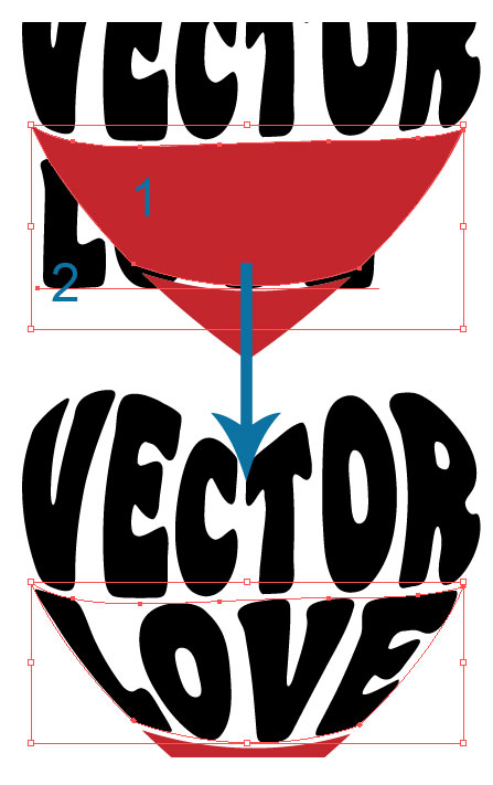
Select the word, “VECTOR” with Selection Tool(V). Choose Object > Arrange > Send to Back (you can also access that by right clicking on your letters while it is still selected).
Now press Shift Key and with the Selection Tool (V) click on top heart shape and “VECTOR” and choose Object > Envelop Distort > Make with Top Object. Keep the Smart Guides On(Ctrl/Comm + U) to help you see your shape if the letter gets hidden behind the shape.

Step 8:
Repeat the process mentioned in Step 6 with the word “LOVE”, select it Send it to Back, then select (with Selection Tool-V) the bottom heart shape and the letters while holding down Shift key. And choose, Object > Envelop Distort > Make with Top Object.
Step 9:
Now we are almost done. If you wish to change the colors of the text, you can do it by selecting them all (Ctrl/Commmand + A) and then choose Object > Envelop Distort > Edit Contents. I kept the colors same as black.
Finally, just unhide the heart shape that we have hidden and locked in Step 2. Click on the eye button to unhide it. I have changed it’s Fill color to a shade of pink. I also deleted the unwanted shapes left over from the other heart shape as we do not need it. Now it should look something as shown below.

Step 10:
Finally, to make an interesting background, I use a free vector graphics Halftone-Heart (from Qvectors). Open up the file and copy paste it on a new layer in my document. Drag the layer below so that it is behind the heart shape. Fill it with the same pink color and set the stroke to none.
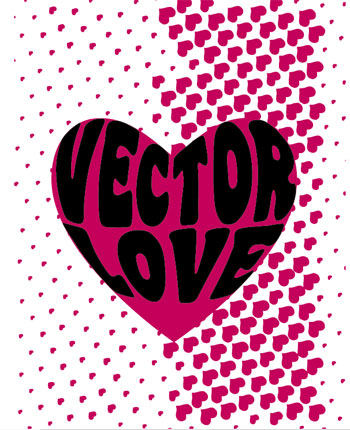
I also deleted the excess paths with Clipping mask. Draw a square shape with Rectangle Tool (M). Select both shapes (pattern and square) then choose, Object > Clipping Mask > Make. Finally, fill it with a Radial Gradient to get the following image.

Here is the another example. I changed the colors and grouped (Object > Group) the entire artwork. Next I apply Effect > Distort > Glass using the following parameters:


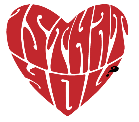
And below you will see a another example image I made long time back using the same technique as shown above with the words, “Is That You?”. You can see the finished piece at my dA.
The key is to experiment with different shapes and text, I hope you have learnt something new in this tutorial. I will love to see what you have done using this technique.
Cool tutorial, I love how you did the type at the end :o)
Great tutorial and tips. Envelope mesh is powerful indeed! Thanks for sharing.
I STILL DONT GET HOW TO DO THE HEART IS A LITTLE HARD
@KRAZI: Drawing heart shape in Illustrator is quite easy, try to follow this tutorial, The perfect heart shape. Hope that helps!
@losl & Devlin Thanks!
tutorial ini sanagt membantu bagi pemula
sukses for you
I can’t seem to get the Vector-word right. It gets all warped instead of following the outlines of the top of the heart. The top of the word is bent, as if it were following a 3D heart. What am I doing wrong?
@Hannah: I am not getting what you’re meaning to say, but some suggestions: Are you placing the text above the shape? Also try playing with the size of the font.
@didik amansyah: English please.
Oh I fixed it somehow, it looks great! Thanks for a great tutorial!
thanks a lot
I AM WOMAAAAAAN!!!!!
and
i eat weiners ^.^
I can’t get passed Step 5, I’ve tried this on PC and Mac and it just won’t work. All that happens when I hit Subtract from Shape is a line totally disappears.
brilliant, thanks
Great tut. I am more a photoshopper myself but am beginning to think illustrator is worth its weight in gold.
useful tutorial, thanks for sharing 🙂
WOW! I was STRUGGLING with this one. The problem I was having was that I was assuming Illustrator would automatically resize the words, it doesn’t. So once I got that down, it was much better. This article saved my butt big time! Thank you so much!
very useful tutorials. its been helpful in learning illustrator.Thanks
the problem which I am facing is that my top line is not coming properly. It looks like the words are cutting from the top. No matter how small I am keeping the font size.
Been looking all over for this, there’s hardly any decent tutorials on wrapping text around objects or inside objects.
Thanks a lot.
Fantastic
I keep trying but every time I click in ‘make with top object’ a message says:” is require a selection of multiple objects. the top object must be a single path or a mesh” HELP!
我都会了 – -#
this is good
I cant get past step 5 either. Illustrator will now allow me to ungroup the selected objects. Any ideas anyone? Thanks
i dont seem to ungroup the shape! Im stock on step %! helpp!!
i cannot ungroup the shape..help!
Quite a useful post!!
I have tried this tutorial but when I distort the text to match the shape of the heart some of the text edges extend beyond the shape of the heart. How do I get the text to stay inside the shape?
For those who struggle, try kerning the font (keeping it editable… do not outline!) besides changing font size. Sometimes that helps align the font better within the shape. Such an easy tutorial to follow. Thanks for sharing!
For those having trouble with step 5 try clicking on (while holding alt) “Divide” instead of the suggested “Subtract from shape”.
It worked for me and should work for you as well.
thank you so much, this tutorial was of great help to me :3
Thanks Mario! I couldn’t get the shape to divide either. Your suggestion worked! I can now try to finish the tutorial. (Glad I wasn’t the only one who had this problem, always nice to know you’re not a total idiot for not being able to get it right.)
I’m also having problems with the top word. The letters are being distorted towards the top as if being wrapped around a 3D object.
this tutorial really helped.
Really thank you. I found what i need. Here what i’ve done with your instructions. 🙂
http://i46.tinypic.com/2prda9s.jpg
Hi there! I simply want to give an enormous thumbs up for the
nice data you have got right here on this post. I will probably be coming again to your blog for extra soon.
I think that everything composed made a lot of sense. But, consider this, what if you added a little content?
I am not suggesting your content is not solid., but what if you
added a headline that makes people want more?
I mean Illustrator Tutorial: Warp Text Inside A Heart Shape
| Vector Diary is kinda boring. You could peek at Yahoo’s front page and watch how they write post titles to grab people interested. You might try adding a video or a related pic or two to get readers interested about what you’ve
got to say. Just my opinion, it could bring your website a little bit more interesting.